
Light vs Dark Flooring in NZ: Choose for the Room, Not the Trend
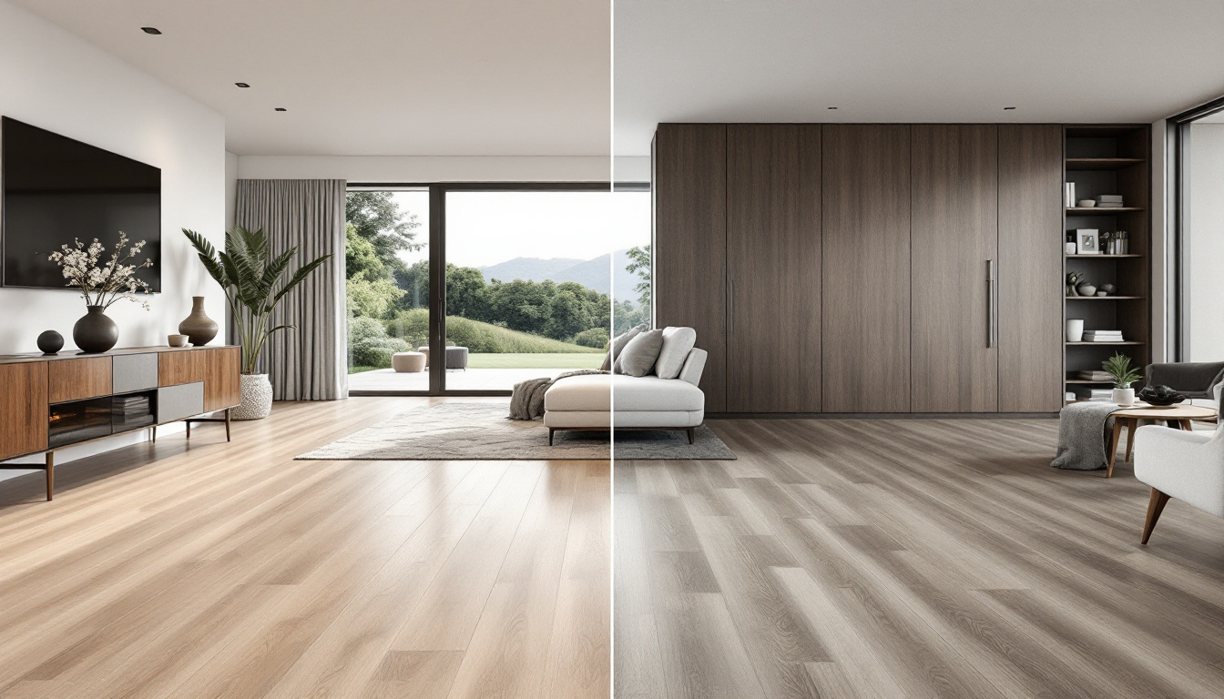
Mia arrived at the flooring consultation certain that she wanted a dark oak floor. The saved photographs on her phone all had the same moody calm: charcoal joinery, deep timber and pools of warm light. Her partner Sam preferred a pale natural finish because their Auckland house had a shaded hallway and a compact open-plan living area. Both could point to beautiful examples. Neither photograph showed their room.
That is the central lesson in choosing light versus dark flooring. Colour does not work alone. It reacts to daylight, room scale, wall colour, cabinetry, furniture, surface texture and the amount of visual contrast you enjoy. It also changes what dust, fibres, crumbs and marks your eye notices. The best choice is not the colour currently winning social media. It is the floor that creates the right relationship with the home and remains acceptable on an ordinary Tuesday.
The first room changed the argument
The couple placed a dark sample near the living-room doors at midday. In the bright patch beside the glass, its grain looked rich and controlled. Two metres away, under the dining table, the same board appeared heavier. Their dark dining chairs almost disappeared into it, while the pale walls became more prominent through contrast.
The light sample behaved differently. It reflected more available light and made the transition from hallway to living area feel quieter. Against their white kitchen it created less drama, but the room felt visually continuous. The choice was not simply bright versus gloomy. The dark floor gave the fixed elements stronger edges. The light floor reduced the number of obvious boundaries.
This is why claims that light floors always make rooms look bigger are too crude. A lighter floor can reduce visual weight and support continuity, but scale also depends on plank format, direction, contrast and how much of the surface remains visible. A room filled with strongly contrasting furniture can still feel busy over a pale floor. A dark floor can feel expansive when it flows through connected spaces and the rest of the palette is controlled.
What the light sample offered
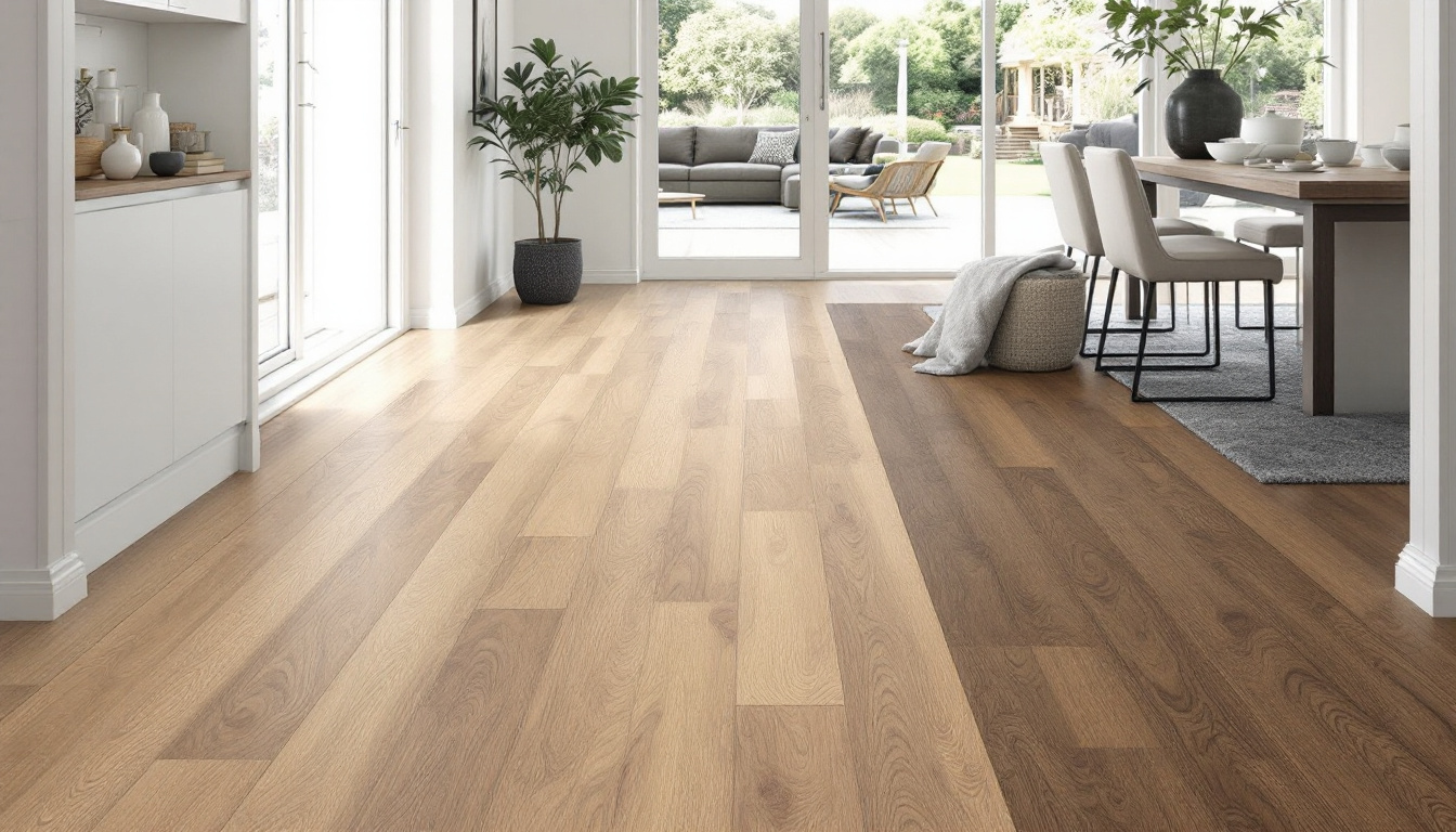
In the hallway, the pale board made the narrow section feel less segmented from the living room. Its lower visual weight suited the couple's wish for a relaxed background. Their dark art frames and dining furniture remained clear focal points instead of blending into the surface.
Light floors can work especially well when the design brief asks for softness, casual warmth or a neutral base. They can support Scandinavian, coastal and contemporary interiors, but those labels should not control the choice. A pale floor may be creamy, greyed, raw-looking, honey-toned or whitewashed. Each undertone reacts differently with paint, stone and timber furniture.
A light surface is not maintenance-free camouflage. Dark hair, some spills, soil and coloured marks may show clearly on it. Grain, pattern, texture and sheen often influence visibility more than the simple light-dark label. A very uniform pale floor can reveal a dark crumb immediately, while a varied mid-light design may disguise ordinary debris better.
Light timber also should not be treated as blank white paper. Genuine wood and convincing timber-look products contain variation. Warm daylight can intensify yellow or honey notes. Cool grey walls can make a warm floor appear warmer by contrast. The sample has to meet the actual palette.
What the dark sample offered
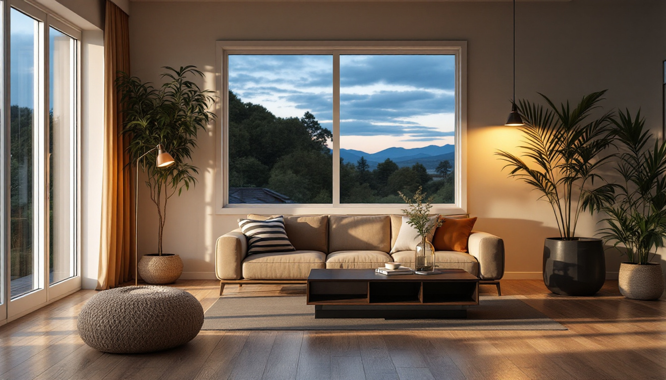
The dark board gave the bright end of the living space a stronger architectural base. Beside the glass doors it looked sophisticated and made the pale sofa feel crisp. At night, under warm lamps, it created the atmosphere Mia had saved on her phone. That response was real and valuable. It simply was not consistent across every part of the house.
Dark flooring can establish contrast, make pale cabinetry stand out and connect with black or deep-toned architectural details. It can feel grounded rather than small when the room has enough light, visible floor area and a coherent palette. In a large room, a deep tone may reduce an overly washed-out feeling.
The trade-off is visual sensitivity. Light-coloured dust, lint and pet hair can be conspicuous on a dark, even surface. Fine marks may catch side light depending on the finish. This does not mean dark flooring is impractical. It means the household should assess its real cleaning rhythm and select texture, sheen and variation deliberately.
Dark is also a broad category. Espresso brown, charcoal, smoked oak and deep warm walnut effects do not behave alike. A dark floor with lively grain can feel more forgiving than a flat near-black surface. Undertone matters just as much as depth.
Then they tested the samples at night
The evening test reversed part of the daytime discussion. Their cool ceiling lights flattened the pale board, while a lamp made the dark sample glow. Instead of declaring a winner, they changed the lighting. A warmer lamp in the hallway improved both options and exposed the real issue: some saved interiors looked good because of their lighting design, not because dark flooring performs magic.
Test samples under the lighting you will actually use. If the renovation includes new fittings, compare them together before final approval where possible. Note colour temperature, direction and glare. A textured surface under low side light looks different from the same surface under diffuse daylight.
Take photographs only as notes. Phone cameras adjust exposure and white balance, so the image can misrepresent what your eyes saw. Write a short reaction beside each test: calm, cold, heavy, warm, busy or balanced. Those words reveal the desired effect better than a filtered image.
The fixed finishes made the final call
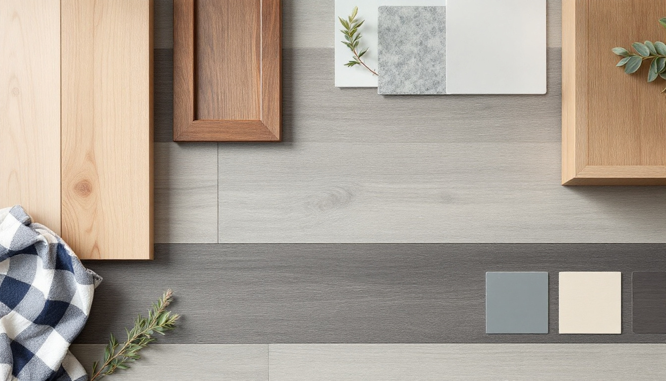
The house already contained warm timber doors that were not being replaced. Against the darkest sample, those doors looked unexpectedly orange. The palest sample was closer in tone but not close enough to appear matched, which made the combination look accidental. A medium natural board created deliberate separation without forcing a contest between two timber colours.
This is a common result. Homeowners begin with a binary choice and discover that the best answer sits between the extremes. A mid-tone can carry some grounding depth while remaining forgiving and visually continuous. Choosing it is not a compromise when it serves the complete palette better.
List every fixed element before approving flooring: cabinetry, benchtops, tiles, fireplaces, internal doors, stair components and large furniture that will remain. Compare undertones rather than trying to make every timber identical. Deliberate contrast is usually cleaner than a near-match that misses.
An ordinary week is better evidence than a showroom
Mia and Sam lived with the samples for several days. They moved dining chairs over them, placed a little clean pet hair nearby, walked past them in shoes and viewed them after normal household activity. The exercise was not a scratch test or a product-performance experiment. It was a visibility test.
Their dog shed pale hair, which was immediately obvious on the darkest sample. Small dark fibres from the entrance mat stood out on the pale one. The medium board's grain and tonal movement disguised both more effectively. That result belonged to their home and those samples. Another household with dark-haired pets, different soil and a different surface pattern could reach the opposite conclusion.
Think about where the floor will be viewed. Low sunlight across a long surface can reveal texture, dust and marks. A busy entrance receives different debris from a bedroom. An open-plan kitchen exposes the floor to crumbs and changing light. Honest colour selection includes these unglamorous facts.
A five-question decision framework
1. What should be the visual anchor?
Choose whether the floor should quietly support furniture and architecture or act as a strong contrasting surface. Light and mid-tone floors often recede, while dark floors can establish a pronounced base. The surrounding palette can alter either effect.
2. Where does the room receive and lose light?
Map bright and shaded zones across the day. Test every sample in both. A choice that works only beside the largest window has not passed the room test.
3. Which fixed colours must it live beside?
Compare undertones with cabinetry, stone, paint, doors and stairs. Aim for harmony or intentional contrast, not a forced near-match.
4. What does the household make visible?
Consider pet hair, lint, grit, crumbs, sunlight and cleaning frequency. Pattern, grain, texture and sheen can be more important than colour depth alone.
5. Will you still like the relationship when trends move on?
A floor covers a large area and is disruptive to replace. Choose a relationship with the home that can survive a new sofa or wall colour. Trend references can inspire, but they should not overrule the room.
The verdict from the two-room test
There is no universal winner between light and dark flooring in New Zealand homes. Light flooring can support continuity and a softer background. Dark flooring can create depth and architectural contrast. Mid-tones often solve rooms where the extremes fight existing materials or daily upkeep.
Mia and Sam selected the medium natural board, not because it split the difference, but because it worked in both the shaded hallway and brighter living area, related cleanly to the existing doors and handled their everyday visual clutter. Their decision method matters more than their colour.
Shortlist contrasting options, test them in the room for several days, involve fixed finishes and assess ordinary life. That process will outperform an online trend list every time.
Frequently asked questions
Does light flooring make a room look bigger?
It can reduce visual weight and support continuity, but room scale also depends on contrast, plank format, direction, furniture and visible floor area. Test the specific sample in the room.
Does dark flooring make a room look smaller?
Not automatically. Dark flooring can feel grounded and expansive in a well-lit, coherent space, but it may feel heavy in shaded zones or where many furnishings have similar depth.
Which flooring colour hides dirt best?
There is no universal colour. Visibility depends on the colour of local dust, hair and debris, plus the floor's grain, pattern, texture and sheen. Mid-tones with natural variation are often worth testing.
Should flooring match kitchen cabinets?
It does not need to match. Aim for compatible undertones or clear, intentional contrast. A near-match that is slightly wrong can look less resolved than deliberate separation.
How long should flooring samples stay in the room?
Keep them long enough to view morning, afternoon and evening conditions, ideally across several normal days. Move them through bright, shaded and high-use areas before deciding.
## Factual boundaries - The couple is a composite decision scenario, not a claimed Power Dekor customer case study. - Visual effects are framed as design guidance, not guaranteed room outcomes. - No product performance, price or maintenance guarantee is asserted. - BlogPosting schema remains platform-owned.