Choosing oak wood flooring is the easy part. The hard part is making it look right in your home — not too yellow, not too flat, not accidentally “new-build beige”.
Here’s the secret: oak flooring doesn’t just “match” colours — it reacts to them. Light, paint undertones, soft furnishings, and even metals (brass vs chrome) can pull oak warmer or cooler. So instead of obsessing over a hundred paint swatches, start with the vibe you want your room to feel like… then choose a palette that makes your oak sing.
Power Dekor’s engineered hardwood range is built for real homes — a European oak top layer over a Swedish pine core/backing for stability, finished with multiple UV-cured coats for durability. That means you can focus on styling with confidence: once the floor tone is right, the rest becomes a design game.
Below are palette “recipes” you can copy. Pick the chapter that matches your mood.
Before we start: the oak undertone cheat code (so you don’t “yellow” your room)
If you only remember one thing, remember this:
- Warm oak (honey, caramel, golden) looks best with soft warm whites, clay, olive, camel, and warm metals (brass).
- Neutral oak (balanced beige/stone) plays well with greige, crisp whites, black accents, and both chrome + brass.
- Weathered/washed oak loves coastal neutrals, muted blue-greens, and natural textures.
And a common mistake: If your walls + lighting + rugs are all warm and your oak is warm, the whole room can look overly yellow. The fix isn’t “cool everything down”—it’s adding stone/greige/green and texture to calm it.
Chapter 1: “Make it brighter, bigger, calmer”
These palettes are for homes that want that clean, airy, expensive simplicity — the kind that feels like a boutique hotel in daylight.
Palette: Soft Scandinavian (airy, tidy, modern)
The feeling: calm, clean, light-filled
Best rooms: open-plan living, hallways, smaller spaces
Colour recipe (60/30/10):
- 60% warm white (not creamy-yellow)
- 30% light greige / oatmeal
- 10% matte black (frames, handles, lighting)
Textures that sell the look: linen curtains, boucle chair, pale wool rug
Oak wood flooring match:
- Oak Vintage Cream (£105/m²) — for the “fresh & bright” base
- OT10255 – Oak Nature (£128/m²) — for a slightly more natural warmth
Use this palette if you want your space to feel “organised” even when it’s lived in.
Palette: Warm Japandi (minimal but not cold)
The feeling: serene, intentional, quiet luxury
Best rooms: bedrooms, calm living rooms, study corners
Colour recipe:
- 60% warm white
- 30% oat / sand / pale timber
- 10% soft black or dark bronze
Texture cues: timber slats, paper lamps, cotton bedding, ceramic vases
Oak wood flooring match:
- Oak Wheatfield (£128/m²) — warm and soothing
- Oak Vintage Cream (£105/m²) — for extra brightness
This palette is about less pattern, more texture. Your oak becomes the hero without yelling.
Palette: “Cream + Stone” Contemporary (the safe-but-stunning neutral)
The feeling: expensive neutral, not boring neutral
Best rooms: anywhere you want timeless resale-friendly style
Colour recipe:
- 60% soft cream
- 30% stone grey-beige (rugs/sofa)
- 10% brushed metal accents (brass or chrome)
Style tip: choose one statement piece (art or lighting). Everything else stays calm.
Oak wood flooring match:
- Oak Prague (£115/m²) — balanced and versatile
- OT10160 – Oak Yellowstone (£109/m²) — slightly stronger character
Chapter 2: “Coastal, relaxed, not theme-park beach”
This is coastal done properly: muted, natural, grown-up. Think “sunlight + linen + quiet waves”, not seashell décor.
Palette: Sand & Salt (coastal without clichés)
The feeling: light, breezy, grounded
Best rooms: bright living rooms, open-plan spaces
Colour recipe:
- 60% chalky white
- 30% sand + oatmeal neutrals
- 10% sea-glass blue/grey-green
Textures that matter: jute rug, rattan, linen, pale stone
Oak wood flooring match:
- OT10388 – Oak Driftwood (£128/m²) — the perfect “washed” coastal base
- Oak Wheatfield (£128/m²) — for a sunnier coastal warmth
Driftwood is the shortcut to that “relaxed but styled” feeling.
Palette: Misty Blue-Grey + Natural Oak (quiet coastal modern)
The feeling: calm, slightly cool, designer-led
Best rooms: bedrooms, guest rooms, modern coastal homes
Colour recipe:
- 60% soft white
- 30% misty blue-grey
- 10% black accents or dark timber
Texture cues: knit throws, simple bedding, matte ceramics
Oak wood flooring match:
- Oak Prague (£115/m²) — keeps it clean and modern
- OT10160 – Oak Yellowstone (£109/m²) — if you want a touch more warmth
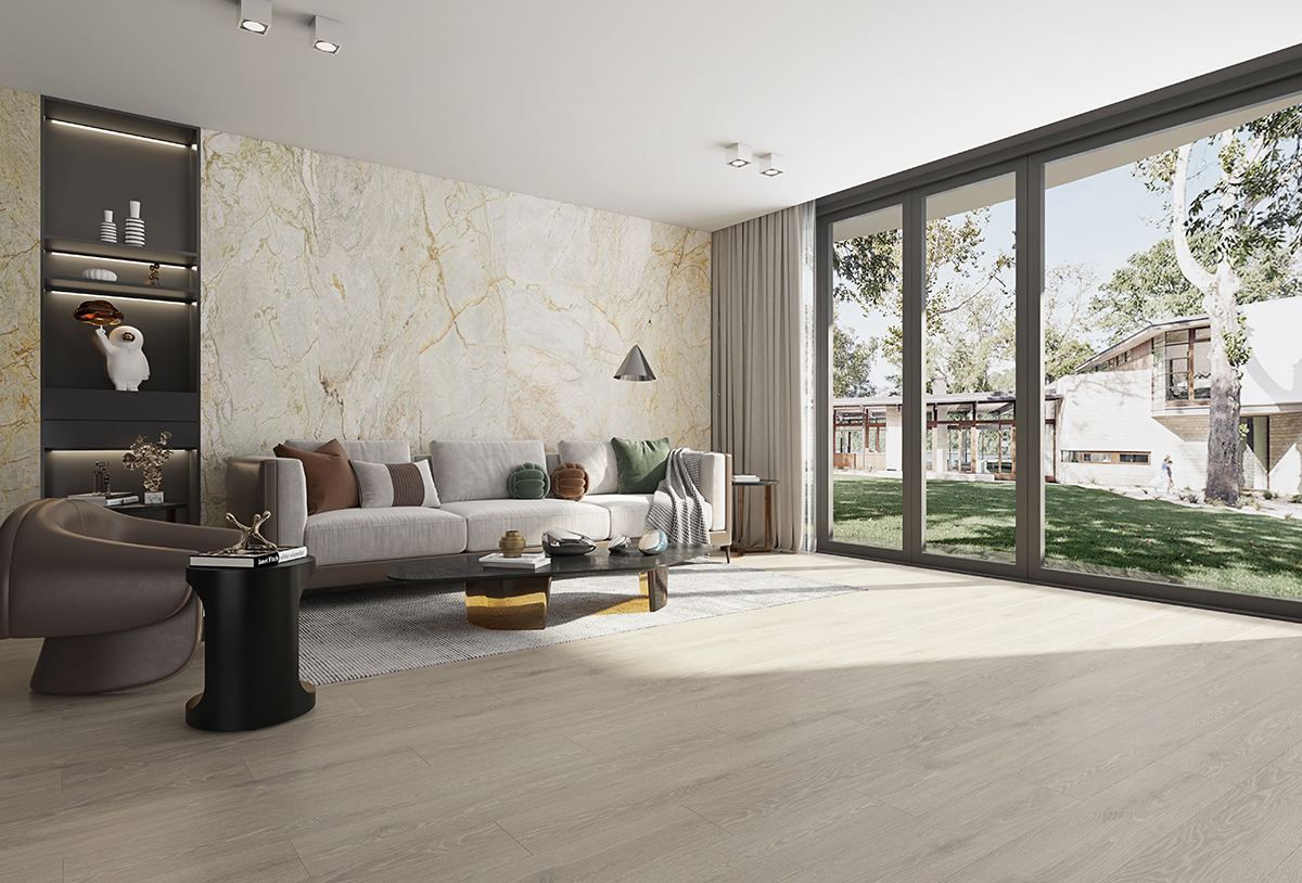
Chapter 3: “Modern edge — clean lines, strong contrast”
If you like black fixtures, sharp silhouettes, and a more architectural feel, these palettes keep oak wood flooring looking crisp (not rustic).
Palette: Greige Minimalism (architect clean)
The feeling: modern, quiet, structured
Best rooms: new builds, apartments, minimal interiors
Colour recipe:
- 60% greige walls
- 30% crisp off-white (trim/ceiling/curtains)
- 10% charcoal/black
Pro styling move: keep patterns minimal; let shapes + lighting do the work.
Oak wood flooring match:
- Oak Prague (£115/m²) — neutral anchor
- OT10160 – Oak Yellowstone (£109/m²) — slightly bolder grain energy
Palette: Black + White + Oak (gallery vibe, warmed up)
The feeling: crisp, high-contrast, intentional
Best rooms: living rooms with artwork, modern kitchens/dining
Colour recipe:
- 60% white
- 30% soft grey
- 10% black
Texture cues: black metal, ribbed glass, structured upholstery
Oak wood flooring match:
- OT10160 – Oak Yellowstone (£109/m²) — balances the sharpness
- Oak Espresso (£110/m²) — if you want the contrast stronger
Palette: Espresso Contemporary (bold but still liveable)
The feeling: confident, modern, “designer kitchen + calm lounge”
Best rooms: open plan with black tapware or dark joinery
Colour recipe:
- 60% warm white
- 30% stone / warm grey
- 10% espresso/black accents
Oak wood flooring match:
- Oak Espresso (£110/m²) — defined and modern
- Oak Twilight (£128/m²) — moodier, richer, more dramatic
This is for people who want oak to feel sharp rather than rustic.
Chapter 4: “Moody luxe — evening rooms that feel expensive”
These palettes are for that cosy, cinematic vibe — where the space looks best after 4pm with lamps on.
Palette: Mocha Lounge (hotel cosy)
The feeling: warm, layered, luxurious
Best rooms: living rooms, media rooms, master bedrooms
Colour recipe:
- 60% warm beige
- 30% camel/caramel
- 10% chocolate brown accents
Texture cues: velvet, leather, heavy curtains, warm lighting
Oak wood flooring match:
- Oak Mocha (£128/m²) — the “instant luxury” option
- Oak Espresso (£110/m²) — if you want it slightly sharper
Palette: Twilight Drama (deep colour + warm oak)
The feeling: sophisticated, moody, statement-ready
Best rooms: dining rooms, feature-wall bedrooms, home office
Colour recipe:
- 60% deep navy/charcoal/blue-green (feature wall)
- 30% warm white
- 10% brass accents
Oak wood flooring match:
- Oak Twilight (£128/m²) — built for contrast
- OT10310 – Oak Bordeaux (£125/m²) — warm, classic, and rich
This palette makes oak look intentional, not accidental.
The “pick your floor first” mini-guide (so readers actually convert)
If you want the quickest path to the right oak wood flooring tone, choose your outcome:
- “I want it brighter” → Oak Vintage Cream (£105/m²) or Oak Nature (£128/m²)
- “I want coastal calm” → Oak Driftwood (£128/m²) or Oak Wheatfield (£128/m²)
- “I want modern + clean” → Oak Prague (£115/m²) or Oak Yellowstone (£109/m²)
- “I want moody luxe” → Oak Mocha (£128/m²) / Oak Twilight (£128/m²) / Oak Bordeaux (£125/m²)
- “I want contrast and edge” → Oak Espresso (£110/m²)
And if you’re stuck between two: pick the one that matches your home’s light. North-facing rooms usually prefer warmer oaks; strong sunny rooms can handle neutral or weathered tones beautifully.
Closing: Don’t decorate—choreograph the room
The best interiors aren’t “colour matched”. They’re mood matched. When your palette supports your oak wood flooring (instead of fighting it), everything feels smoother: the sofa looks better, the walls feel cleaner, and the whole home reads as “designed”.
If you’re ready to bring one of these palettes to life, explore Power Dekor’s premium engineered wood flooring range—each oak tone is designed to give you that real-timber look with a stable engineered build and a durable pre-finished surface. Start with the vibe you want (bright, coastal, modern, or moody), then choose the oak shade that matches it—and you’ll get a finish that looks considered from day one.